Packaging & identity
Verde Apotek
A botanical pharmacy that wanted to look like it had always been there. We gave it dark glass, a green you can almost smell and labels you read twice.
Client
Verde Apotek
Year
2026
Location
Gothenburg
Services
Identity, Packaging, Photography direction

Overview
The brief
Verde makes plant remedies in small batches and sells them through its own shop and a handful of independent pharmacies. The old packaging looked like a supplement brand. The founders wanted something closer to an old apothecary, without the costume.
What we made
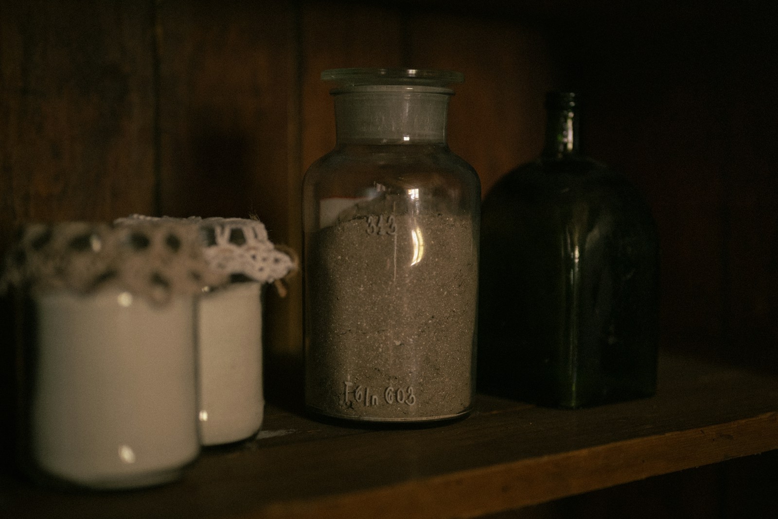
We built the identity around the black glass bottles they already used, one deep green and a narrow wordmark that still reads at eight millimetres. Every label puts the plant’s Latin name first and the product second, which turned out to be the detail customers mention most.




Packaging & identity
Verde Apotek
A botanical pharmacy that wanted to look like it had always been there. We gave it dark glass, a green you can almost smell and labels you read twice.
Client
Verde Apotek
Year
2026
Location
Gothenburg
Services
Identity, Packaging, Photography direction
Overview
The brief
Verde makes plant remedies in small batches and sells them through its own shop and a handful of independent pharmacies. The old packaging looked like a supplement brand. The founders wanted something closer to an old apothecary, without the costume.
What we made
We built the identity around the black glass bottles they already used, one deep green and a narrow wordmark that still reads at eight millimetres. Every label puts the plant’s Latin name first and the product second, which turned out to be the detail customers mention most.
Packaging & identity
Verde Apotek
A botanical pharmacy that wanted to look like it had always been there. We gave it dark glass, a green you can almost smell and labels you read twice.
Client
Verde Apotek
Year
2026
Location
Gothenburg
Services
Identity, Packaging, Photography direction
Overview
The brief
Verde makes plant remedies in small batches and sells them through its own shop and a handful of independent pharmacies. The old packaging looked like a supplement brand. The founders wanted something closer to an old apothecary, without the costume.
What we made
We built the identity around the black glass bottles they already used, one deep green and a narrow wordmark that still reads at eight millimetres. Every label puts the plant’s Latin name first and the product second, which turned out to be the detail customers mention most.